The Overview page is the first screen you see after signing in. It gives you an at-a-glance health summary of your entire fleet — four live KPI tiles, three activity charts, a fleet heatmap, and quick-jump tiles to every other section of the console. All metrics refresh automatically every 30 seconds without a page reload.Documentation Index
Fetch the complete documentation index at: https://www.halite-app.com/llms.txt
Use this file to discover all available pages before exploring further.
KPI tiles
The four stat cards at the top of the page answer the most common operational questions at a glance:| Tile | Source | What it measures |
|---|---|---|
| Online minions | /api/minions | Minions whose status is online out of the total known |
| Pending keys | /api/keys | Keys whose status is pending (awaiting acceptance) |
| Running jobs | /api/jobs/activity | Jobs currently in-flight according to the scheduler’s active-JID cache |
| Jobs · 24h | /api/jobs/activity | Total jobs dispatched in the last 24 hours |

The KPI tiles render a dash (
—) for any metric your role does not have permission to view. The tiles are independent — having view:job:* but not view:key:* is valid.Activity charts
Below the KPI row, three charts give you a time-series and distribution picture of fleet activity:Job activity area chart
A 24-hour area chart of jobs dispatched per hour, built from thejobs_index database table. The server buckets the data by hour before sending it to the browser, so the chart scales past whatever the in-memory job-cache can hold. The active_known flag lets the UI warn you when the background scheduler has not yet ticked.
Minion-status donut
A donut chart breaking down all known minions by their status: online, offline, pending, rejected, or denied. Data comes from the same minion snapshot table used by the Minions page.Key-status bar chart
A bar chart grouping all keys by their approval state (accepted, pending, rejected, denied). This gives you an inventory-level view of fleet onboarding health. The data is served live from the Salt master via the same/api/keys endpoint used by the Keys page.
Recent activity
When the event stream is enabled, the Overview includes a Recent activity widget — a compact, live-updating list of the latest fleet events (jobs, keys, minions) that links through to the full Activity page. At the top of the widget, a heartbeat indicator with a pulsing dot shows how many events arrived in a recent window (for example, “12 events · last 60 min”). It is a quick pulse-check that the fleet — and the event stream — is alive. An admin tunes the widget from Settings → Activity widget: which categories it shows, whether to hide dispatches or routine successes, how many events to list, and the heartbeat window. Those display settings are read by every user viaGET /api/activity/widget-config; the underlying events are still filtered to the categories your role can view.
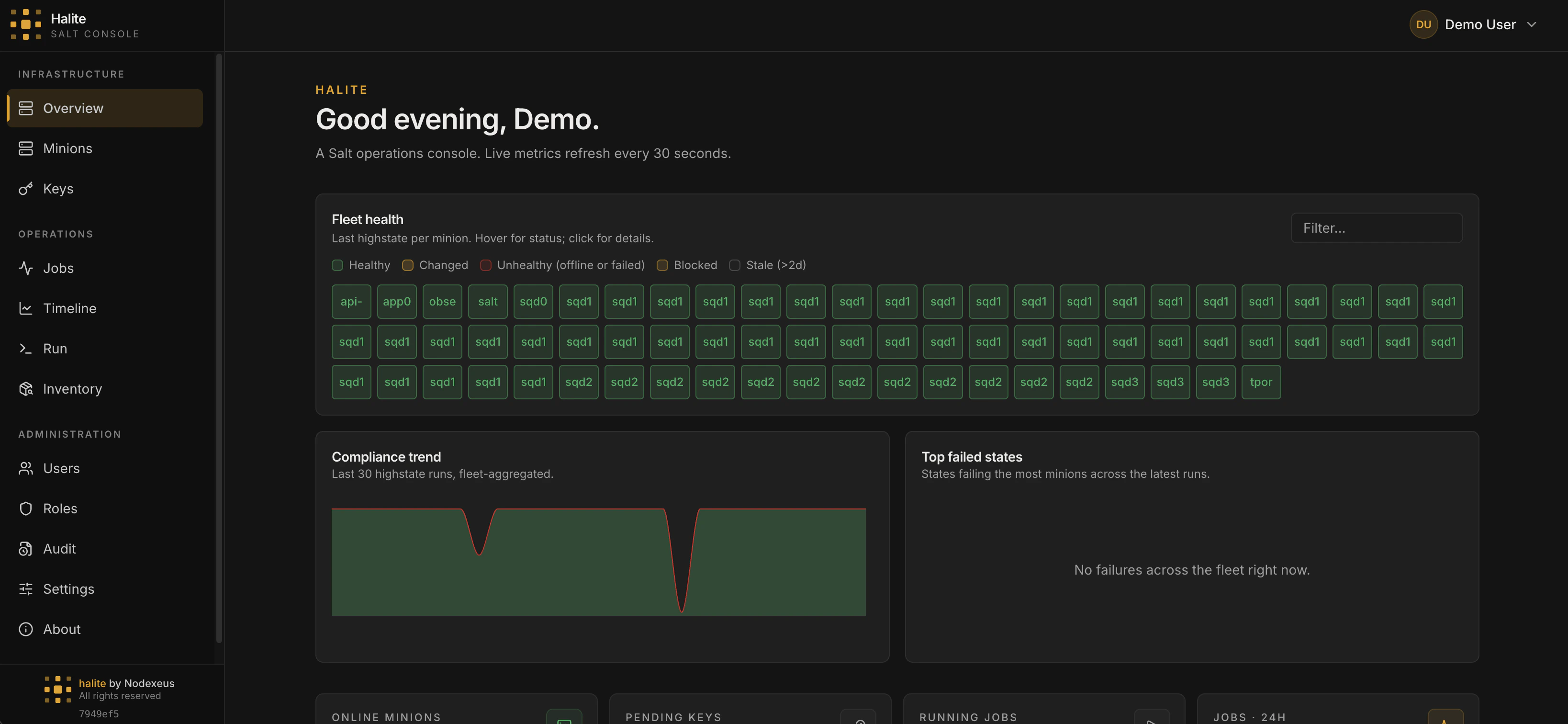
Fleet heatmap and compliance sparkline
Above the KPI row, the fleet heatmap shows every minion as a tile, colour-coded by online/offline status; clicking a tile opens a side panel where you can run a command directly against that minion. Below it, the compliance sparkline and top-failures chart surface recent highstate trends.Navigation tiles
At the bottom of the page, a grid of section tiles links to every major feature. Tiles your role cannot access are hidden automatically — you only see what you have permission to use.Permissions
The Overview page assembles data from multiple endpoints. Each section is gated by the permission of its underlying endpoint:| Section | Permission required |
|---|---|
| Minion KPI / donut | view:minion:* |
| Keys KPI / bar chart | view:key:* |
| Running jobs / area chart | view:job:* |